We realise that it is so much easier to spot a bad design than it is to spot a good one. There is a famous quote from William Morris, a famous textile designer: “Have nothing in your house that you do not know to be useful, or believe to be beautiful.” A good label should be both. We have decided to say a few words about different aspects of designing with a label in mind, that you might find useful or informative.
We thought that a good point to start was to discuss the font choice. There will be more blog post, each relating to a different issue. This is our School of Labelling.
When you know exactly what information needs to be on a label (and don’t start designing before you do!) you can start playing around with your options. Depending on the software/website you are using you might have different fonts available. There is a massive library of free fonts from Google Fonts and many other websites, so you usually have some decent choices.
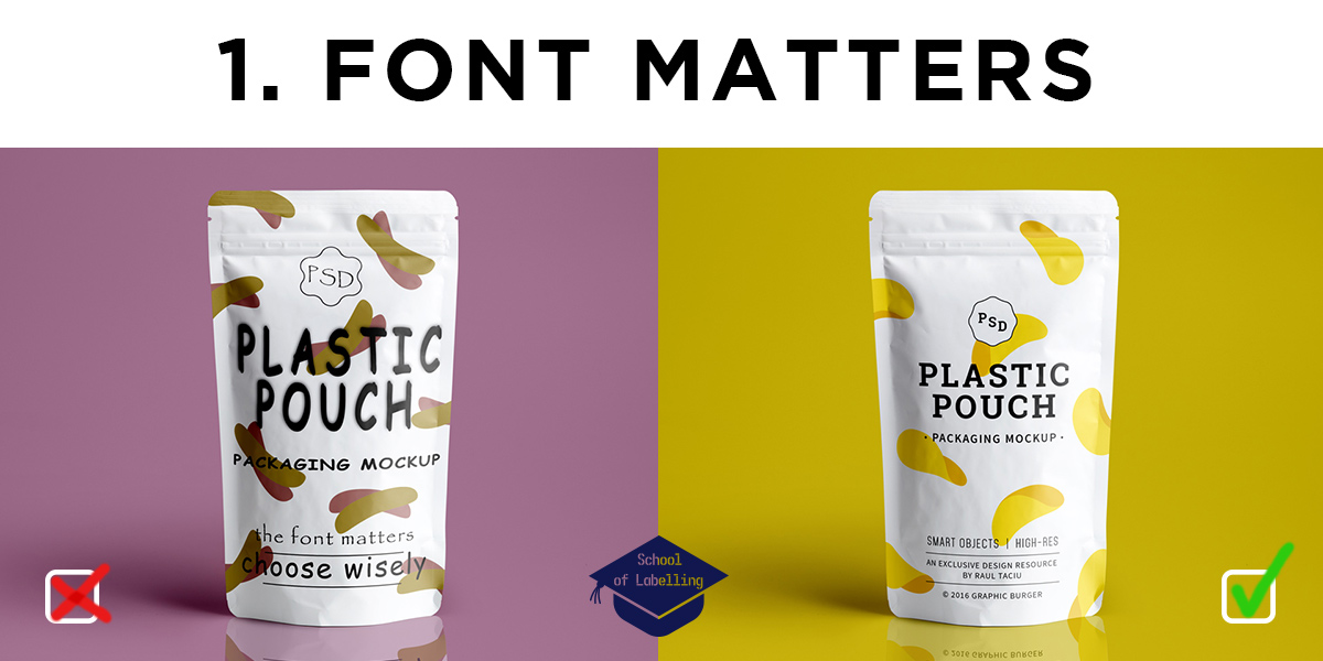
The image above is illustrating the concept of “bad font choices” in a slightly exaggerated way, but all the pitfalls are quite common:
- choosing an unsuitable style ( comic sans, papyrus etc. are usually not the best choice!)
- distorting the font (squeezing or stretching to fit the space)
- using drop shadows or effects too eagerly
There are many more things to mention, but those are the most important in my opinion. If you would like to learn more about typography and design you can visit CreativeLive (loads of tutorials and courses to choose from) and Typewolf (independent typography resource).
Also don’t forget, that should you need it – our design team can create the artwork for you and bring out the best in your product and your brand. Give us a call 01978 664544 or email sales@etiquette.co.uk.
The rest of the articles in the School of Labelling: