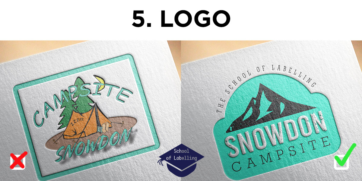
You might be wondering why logo design is the fifth step of School of Labelling guide instead of the first. The reason is that when you are composing a label for your product, I’m assuming you already have a good enough logo. Or you might have an established business and you don’t want to change it at this point.
But it is important to mention it anyway! Perhaps it is time for a change. Better sooner than later – it will only get harder as your business develops.
A logo is an immediate connection to your brand. It is an icon, representation of your identity and values. “Your personal brand is a promise to your clients… a promise of quality, consistency, competency, and reliability” (Jason Hartman, “Become the brand of choice”)
You are exposed to around 10 000 brands/logos a day. So how to design a logo that will stand out, be recognisable, memorable?
There is no simple answer but there are a few things you can do, to make sure your logo stands a chance against the competition. If you decide to embark on a journey towards a better logo, try to make it:
- Simple. There are fairly complex logos out there, but if you are not an expert it’s usually better to opt for a simpler design. Less is more. Start with black and white design and simple shapes. Quite often you can use existing elements available to buy or even download for free (check if it’s free for commercial use). Browse and see what you can find. Search for something that speaks to you and work around it. Choose a simple shape or even a letter and try experimenting with it.
- Scalable. Imagine your logo on a toothbrush handle or a beer bottle cap. If you can’t see what it is at that point- it’s not scalable. Simplify it or reduce the number of elements. Change the font. Keep trying until your logo works when shrunken down.
- Flat. Avoid 3D shapes and drop shadows. I know – those are often used by designers, but it is easier to work with flat, two-dimensional artwork.
- Well-positioned. Do some research and make sure the style you have chosen is in tune with your products/services. Your logo might end up on many different objects and marketing merchandise. It should look good on its own and as a part of other branding elements. Maybe create a mock-up of a product with the logo on it? Take your initial ideas and look for some feedback.
- Original. Do not copy! It’s ok to get some inspiration but never use other people’s designs, it defeats the purpose of achieving something personal and unique, that represents you and your brand.
I know it’s not easy – many people spend their lifetimes perfecting their design skills and it still takes them ages to come up with great logos. But hopefully, those five rules will shed some light on the logo design process. You can always get in touch with our design team to discuss your concerns and ask questions, we’re always happy to help. You can call us on 01978 644544 or email sales@etiquette.co.uk.
The rest of the articles in the School of Labelling: