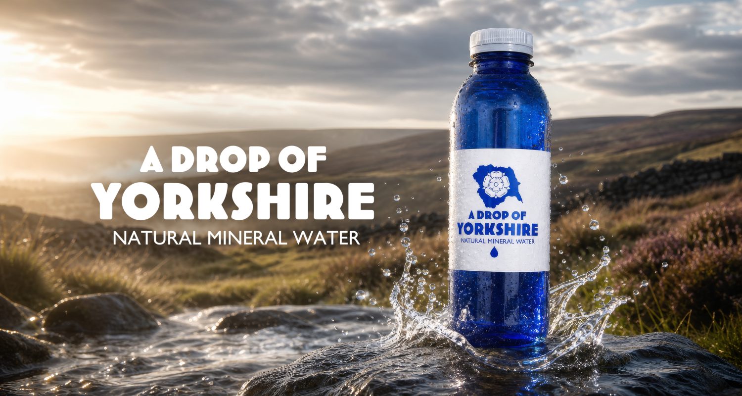
We recently produced bottle labels for A Drop of Yorkshire, a bottled water brand with a strong Yorkshire identity and a clean, confident look.
The label design is deliberately simple: one colour printed onto a crisp white paper, creating a strong contrast against the deep blue bottle. The blue artwork ties directly into the bottle colour, while the white label gives the branding space to stand out.
At the centre of the design is the Yorkshire-inspired mark and bold typography. With no unnecessary graphics or effects, the identity feels clear, recognisable and refined.
The labels were produced using the latest UV ink technology, giving the blue print excellent sharpness, consistency and definition. This is paired with a premium material, helping the label apply cleanly while maintaining the bright white finish that makes the design work so well.
It is a great example of how effective packaging does not always need to be complicated.
One colour. One strong identity. The right material. And a bottle that becomes part of the design itself.
If you would like to talk to us about bottle labels for your products, contact us today!